I like taking pictures of things in windows* because of the layers you can see all in one glance. Here's one I took at Universal Studios Orlando where the streets are set up like an old Hollywood backlot of New York City. Of course I did my favorite Poster Edges filter and boosted the color in Photoshop to make it more interesting.
When you shoot the images, look at your scene carefully before you snap to make sure the actual elements and the reflections line up in a pleasing way.
* see others here and more Photoshop filters here.
Saturday, February 23, 2013
Saturday, February 9, 2013
As Nina Garcia would say...
...There's a taste level problem here.
 My workplace's building has touristy shops on the first floor. One store offers clothing that suffers from a "lack of editing," to quote Project Runway again.
A different section of the window display, while still trashy, makes for a fun Photoshop project.
See below...
 My workplace's building has touristy shops on the first floor. One store offers clothing that suffers from a "lack of editing," to quote Project Runway again.
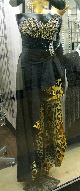
All items, from jeans to gowns to jewelry, have about a half dozen-too-many design elements, chosen for maximum look-at-me-ness. Each dress features stew of sequins, strapless, backless, sheer netting, cut-outs, cut-down-to-there, cut-up-to-there, asymmetrical hems, ruffles, plastic jewel encrusting, foil imprints, animal prints, rosettes, grommets, laces, chains, laces...you name it.
Take the dress at right for example. Remove the:
1. leopard lining
2. high-low asymmetrical hem
3. encrusting on the side wrap
4. whatever might be happening in back (You can't see the reverse so god only knows what's going on there.)
...and it could be wearable, if the plastic "jewels" don't look too bad once you get close. A different section of the window display, while still trashy, makes for a fun Photoshop project.
See below...
 |
| I made a duplicate layer of the original photo and used the Paint Daubs filter on it. I don't know what the settings were...I just messed around until I liked how it looked. |
 |
| I duplicated the original layer again and used the Poster Edges filter on it. |
Subscribe to:
Comments (Atom)


