Other stuff I do...

Sunday, November 15, 2015

Gift Exchange with the Gals? Play the Note Card!

Do you exchange gifts with a group of friends? Or need to have a collection of hostess gifts or something nice for the kids' teachers? Here's an idea for a gift that supports artists and provides you with a perfect all-ages, all-occasion gift. 

There are many, many choices of lovely notecards with blank insides on etsy.com. Buy a handful of different sets and then mix them up into sets of 5 or 6. Make as many sets as you need for all your gift-giving occasions. Put each set into a small printed paper bag or colorful envelope with a bow and you're ready to go.

I made a Pinterest page of a zillion choices. Each one links to the page where you can buy.

Don't forget to keep one set for yourself... they are perfect for thank you, congratulations, or sympathy notes.


Sunday, November 8, 2015

Invisibility Cloak -- a handy thing for your car

If you have a hatchback car with a black interior, a large piece of black fabric can be your own "Invisbility Cloak." A two-yard piece of 60" black knit fabric spread over anything in the car virtually makes it disappear to passers-by. Knit fabric doesn't unravel so no hemming is required. And when you don't need it, just fold it up, or don't... it won't wrinkle. Best of all, when you're not using it, it barely takes up any space.

I made one each for my mom and stepdad as gifts. Wait until Joann has a 40% off sale on fabric and you can make an invisibility cloak for about $12.


The groceries and a blanket randomly strewn in the back of my little hatchback.
The black fabric can be seen on the roof.

The Invisibility Cloak has been placed over the items... it looks like nothing is there!


Saturday, August 8, 2015

Coincidental Colors?

Do you find that jewelry, pendants, or whatever you make oftens matches exactly with clothing that's already in your closet? If I wear a piece with an outfit people will say "did you make it specifically for that outfit?" And most of the time the answer is no. It just so happens that when I'm shopping I'm drawn to colors I like and when I'm at the worktable I'm drawn to colors I like. No surprise, they often end up being the same colors. Like this for example...

Sunday, June 28, 2015

Cane Evolution Tutorial

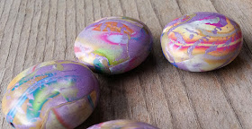
I am not a caner but after my guild's recent workshop with Carol Simmons I had leftover cane chunks to play with. My usual work is more blendy than a typical cane and I favor large patterns over small so I "blew up" my cane.

Here's how I made these...

...from these leftover 1" tall cane slices:

1) I placed a few slices of cane on a sheet of lime colored clay that was about 3 times as thick as the cane slices. Then I ran the sheet through the pasta machine on successively thinner settings (from 1 to 4-5). 

2) I alternated the direction I fed the clay through so the cane would stretch in both directions. The cane clay was more leached than the underlayer so the the cane cracked a bit as it stretched, letting the green underneath show through. 

3) I rolled a log of scrap clay, sliced it into equal portions, and rolled each piece into a ball. 

4) I ripped the cane sheet into random pieces and wrapped them randomly around the ball, covering it completely. I rolled the ball until all the wrapped pieces had melded together. I turned two of the balls into long barrel shapes.

5) With my needle tool I traced lines to loosely define shapes of leaves and petals. 

6) I baked the beads for 15 minutes and then lightly sanded with 1000 grit wet-dry sandpaper. 

7) I rubbed black liquid clay into the etched lines and wiped off the excess with a paper towel.
Then the beads went back into the oven for 15 more minutes. 

8) I sanded them again with 1000 grit. I could have stopped at this point but I like them shiny so I used my buffer.

The cane slices on the beads below were put on a lilac base layer. I didn't etch these beads. I wish I would have, the design would have looked more "focused."

So, there you go. Grab some of those old canes and blow 'em up!


Sunday, June 21, 2015

Great Smokies photo inspires a necklace

My coworker Ashley Macik attended a photography workshop called Spring in the Smokies with instructor Jennifer King a few months ago. She came back with beautiful photos. I really liked the colors in the one at left below so asked if I could "borrow" it for a bead project.

First I pulled out a few colors from the photo:


Then I got to work with my new clay color mixing skills learned in Carol Simmons' workshop in May. I used Premo fuchsia, ultramarine blue, and cadmium yellow, plus black and white to make the 5 colors. I made a variety of shapes and sizes, some etched, some plain. Below are a few after the first baking. Next step: fill the inscribed lines with black liquid clay.

I strung them up but couldn't get them to drape the way I wanted. I also decided I needed more beads because the necklace wasn't long enough.


I made a variety pack of additional beads and strung them up. Ultimately I chose not to use the large round tree bead... I just didn't like it enough. The red and gold each should have been a bit more orange-ish and the eggplant could have been a bit more purple but the colors all look decent together.
I will wear this with an eggplant-colored t-shirt and black skirt.


Tuesday, June 23 P.S.: What a nice surprise to find out I'm on Polymer Clay Daily today. Thanks Cynthia!

Friday, April 17, 2015

Make Large Stamps for Polymer (and nice coloring page designs!)

This is the process I use to create the designs that eventually get turned into stamps. I have access to the full Adobe Creative Suite and I use Photoshop, Illustrator, and Acrobat (PDF) in this process. You may not have access to these programs. Don't worry, you can still make stamp art if you have good paper and a good black fineline marker for clean edges.

After https://www.facebook.com/PolymerClayAnnex/ on Facebook was nice enough to feature my stamps, I said I'd write up my method so here it is...
. . . . . . . . . . . . . . . . . . . . . . 

1. Lightly pencil a 7” x9” rectangle on no-texture paper. I make a very large continuous design stamp so I have lots of mixed-pattern surface area to impress on my beads. All of these were done with the same stamp.

    
Click on the photos to enlarge.  I purchase two stamps at a time so I can cup the clay between two sheets and impress both sides at one time. The stamps are unmounted and very flexible.

2. Fill the whole page with designs/doodles using a fine line or pointed permanent ink black marker. Add some repeating elements but don't make it all the same. You want to end up with lots of different pattern areas to use.

3. Don’t make either the black or white areas more prominent; keep the areas balanced. And keep in mind the scale of your finished items... I make beads so I want my pattern to be fairly small and multiple patterns will fit on one bead.  
4. Make lines in the drawing as neat as you can... smooth paper and a good point on the pen will help you make crisp lines. Make sure the black areas are pretty solid. (If you don't have access to Illustrator or Photoshop, you can skip way down to the bottom...)

5. Scan the drawing at 300 resolution using grayscale or color setting.

6. Open it in Photoshop and reverse it so black becomes white. Image > Adjustments > Invert

This was my first stamp. It was not a successful for beads because the my lines were too fat and far apart. I learned my lesson and made smaller patterns the next time. The items at the top of the page were made with my second stamp.

7. Print the reversed drawing and use your marker to clean up the edges. Because the black ink is now white, you can color black back into any area where the white areas of your original drawing ended up too thin. (Easier than using white paint to cover black areas or edges you're not happy with.)

8. Scan the drawing again and reverse it back to the original black design.

9. Open the jpg file in Adobe Illustrator.

10. Select the drawing using the black arrow tool. On the menu choose Object > Image Trace > Make and Expand(If message box pops up asking you to rasterize, you can say no.)

11. After Make and Expand is finished, you’ll see a bunch of highlighted points all over your art. They serve a purpose but you don't need to do anything with them for this project. Click on the page and they will disappear.


12. Use the white selection arrow to click in a white area of your traced drawing.

13. From the menu, Select > Same > Fill Color to select all the white areas on the page at once. Click delete.

The black area that remains is now a vector art of your drawing, all beautifully smooth and sharp. 


The original scan of a marker drawing.
Try to make the blacks more opaque than shown above before you scan it.


The traced drawing. Click to see it larger.
I love the energy the variation in line weight gives to a drawing.
Uniform line widths are bor-ing!

You can use your art to make clean edged stamps or silk screens. The cleaned-up line drawing also makes a nice coloring book page. Because it is vector art, it can be enlarged to the size of a wall and it will stay sharp. If you were very ambitious you could project it on a wall and paint it or have vinyl cutouts made (Fastsigns.com will do it for you) to apply to the wall.


I save my vector art as a PDF in Illustrator and send it off!
  
14. Now, finally, here's who can turn your lovely art into a stamp: http://readystamps.com/
Read the instructions here before you start:

http://readystamps.com/instructions/ 

You can make some original stamps and help a worthy cause. What's not to love about that!?

Saturday, February 14, 2015

Art Deco Decor

I now know, I am an art deco fan. I stayed for several nights at the Four Seasons Orlando, part of the Walt Disney World resort for the luxury traveler. (Before you think I’ve won the lottery, please know I was only there as a hired hand for a work event.)

Talk about beautiful! I have a phone full of photos for future inspiration, some of which are below. It's not so much that I love each individual piece but I really like the look of it all combined.

Read through this list of hallmarks of art deco design and then mentally check them off as you peruse my photos below.

Characteristics of Art Deco Interior Design: geometric and angular forms, exotic materials, linear decoration, bold
Materials: stainless steel, mirrors, chrome, glass, lacquer, inlaid wood, ebony, marble, rare woods
Design Themes: leaves, branches, feathers, nudes, stylized animals, trapezoids, chevrons, zigzags, sunbursts
Colors: striking, bold, contrast; silver and black, neutral creams and beiges
Furniture: streamlined shapes, no frills, large in scale, chrome, mirrored
Floors: abstract designs, black and white tile, lacquered, polished parquet, large geometric pattern rugs
Lighting: glass (etched, enameled, white or colored), chrome

I condensed the information above from: http://interiordec.about.com/od/decorateforbegin/a/StylesofDecoratingArtDeco.htm


Nature and geometric pattern

Opalescent tile mosaic

Hallway geometric print carpet and wallpaper

Reflective print wallpaper

Reflective print fabric wallpaper

Geometric tile mosaic

Decorative grate on the outdoor path lighting

Geometric wallpaper, stylized animal metallic print picture, silver lights, streamlined shiny table, square pattern tile

Metallic translucent hardware on lighting
Geometric ceiling moulding, wall panels, glass bubble chandeliere

Curved couch and metallic table

Geometric wood chairs, geometric wood table, bold print fabric and rug, stylized animal (peacock) art

Linear, spiky floor lamps, curved art on bold square base

Geometric black iron railings, glass sunburst chandelier, square wall paneling

the dramatic chandelier at night

the top piece of the sink "bowl" slants downward and the bottom piece slants under that to the unseen drain below